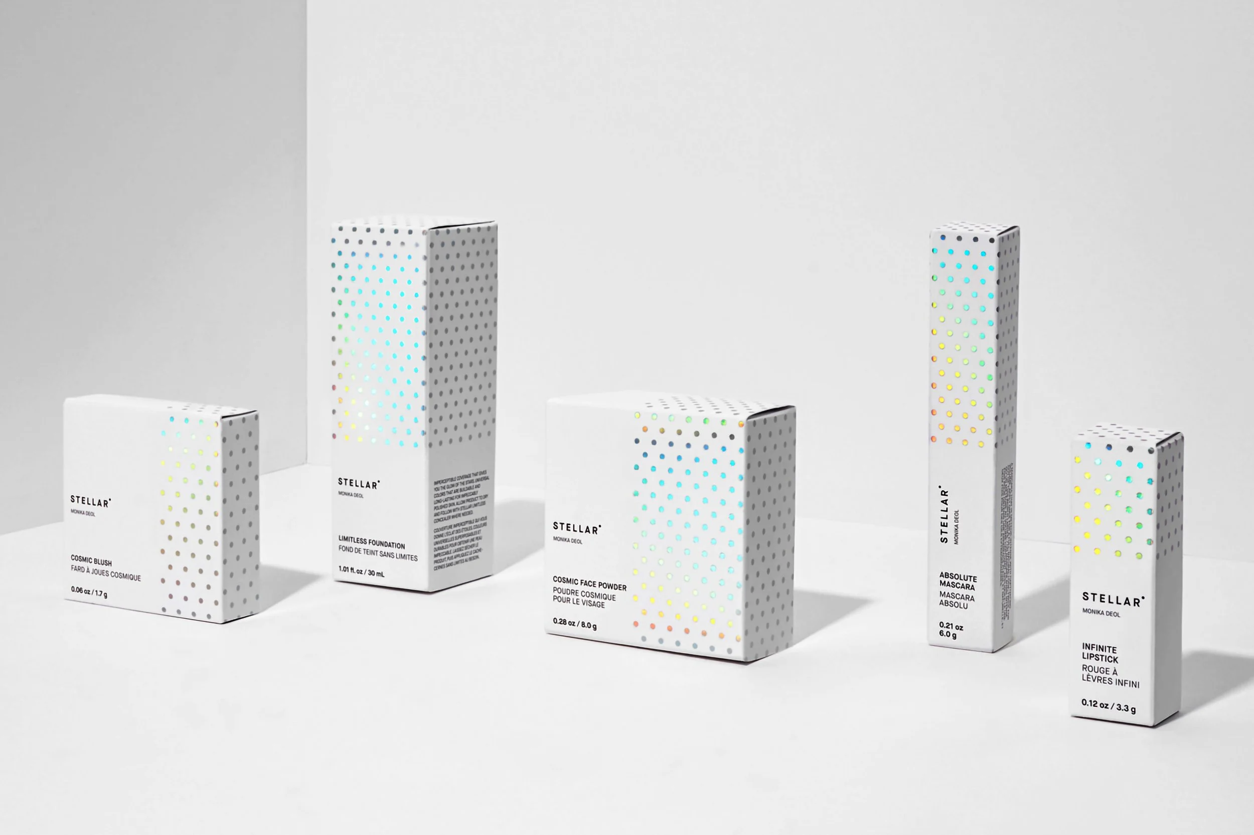
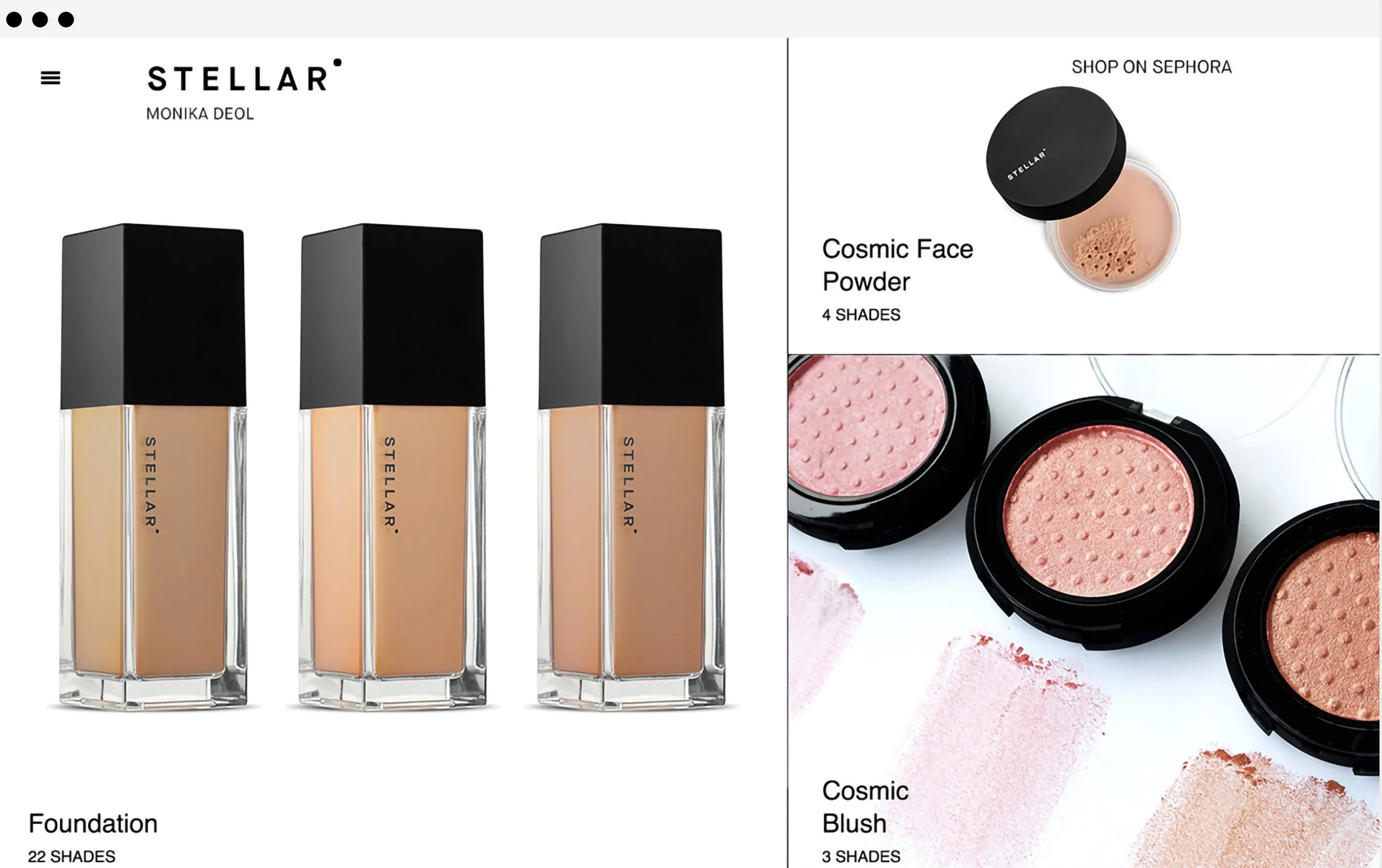
Highlights

Stellar Beauty

Stellar is a high-performance premium makeup line that delivers across all skin colours but with a particular focus on medium tones. The range of products include foundations, concealers, loose powders, blushes, lipsticks, and mascaras, and are available in-store at Sephora North America and worldwide via Sephora online.

Working with BMD in Toronto I was responsible for taking the brand style and developing packaging across the whole range. I was also responsible for creating and maintaining the in-store display units for Sephora.

Set of five skincare and makeup products with minimalistic white packaging decorated with colorful dots, including Cosmic Blush, Limitless Foundation, Cosmic Face Powder, Absolute Mascara, and Infinite Lipstick, arranged on a white surface against a white background.
Various makeup products, including a pink blush in a round container, a beige foundation in a rectangular glass bottle, and multiple packaged items, are arranged on a white surface.
Two women with diverse skin tones pose against a dotted, light background. One has long, dark, wavy hair, and the other has long, straight, dark hair. Both are wearing neutral-toned clothing.
Screenshot of a Sephora website featuring Monika Deol's Stellar makeup collection with foundation bottles, cosmic face powder, and cosmic blush in open containers.

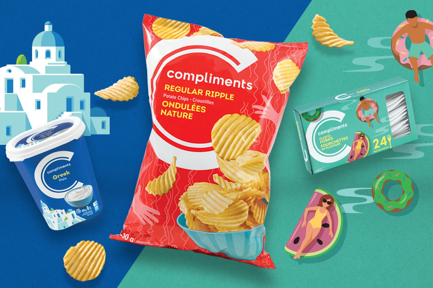
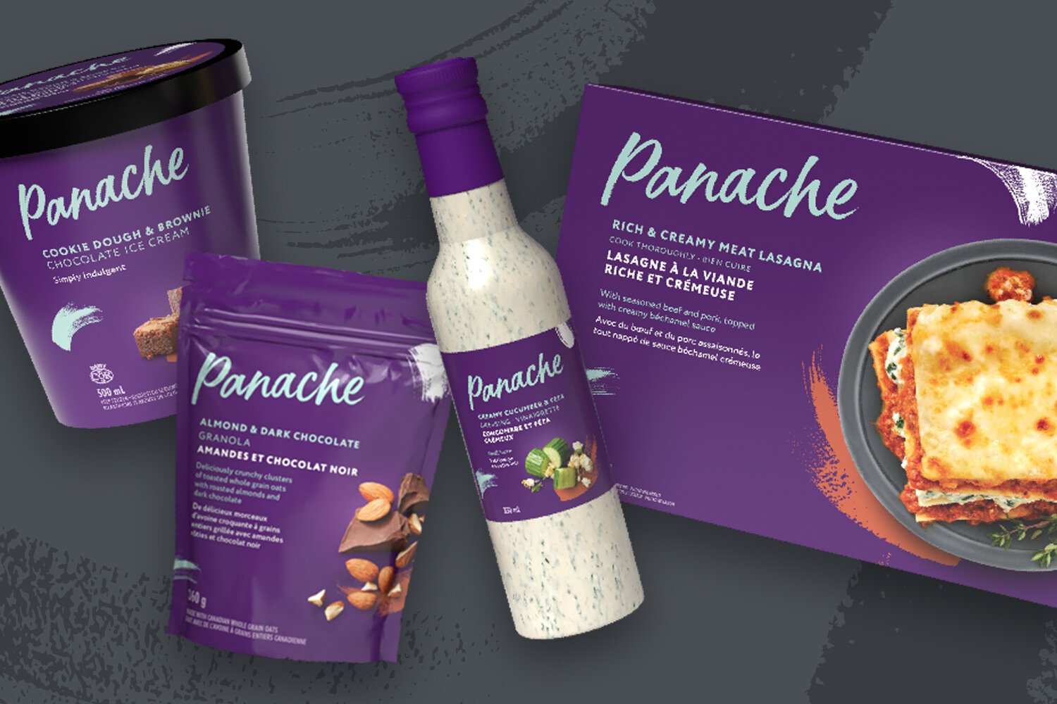
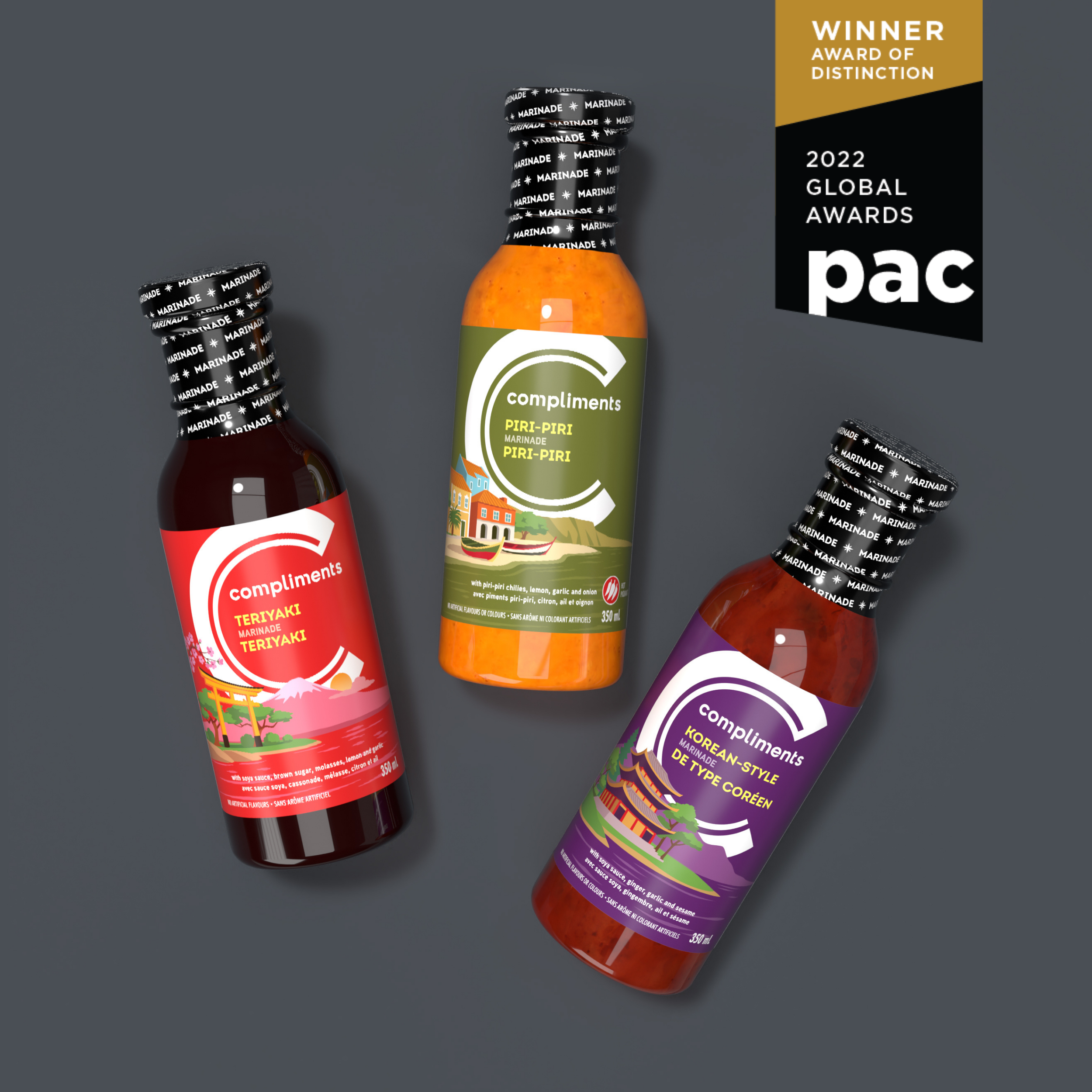
Sobeys Private Label

Working with FISH Agency in Toronto over the course of a year I utilized the established design style for the Compliments and Panache range and designed and produced over 400 individual SKUs.
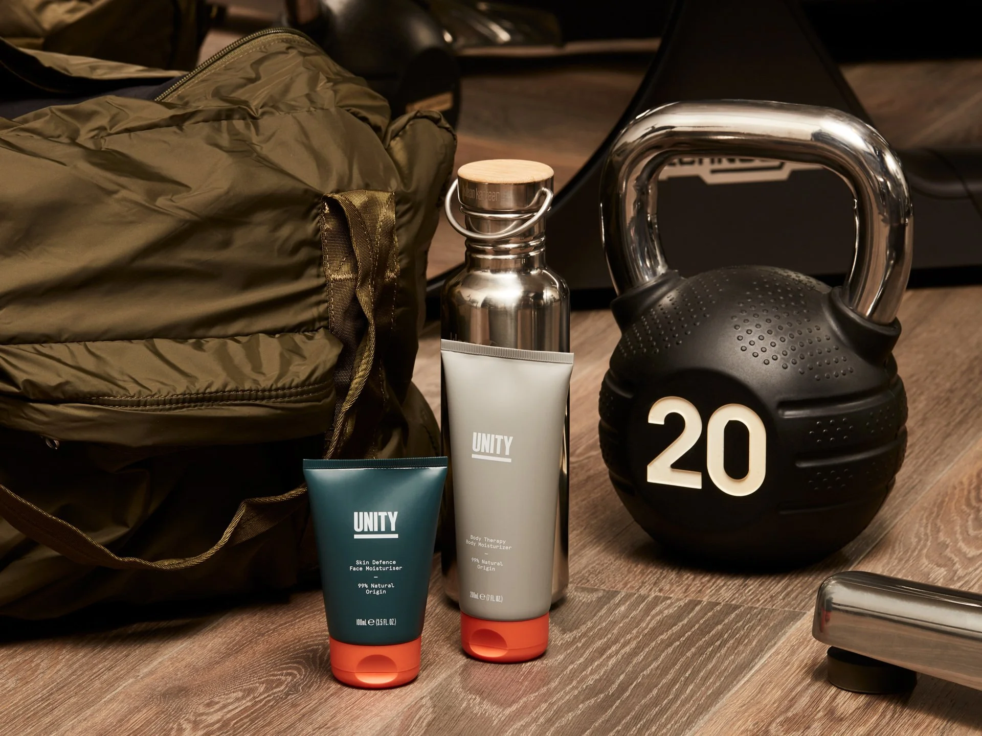
A flat lay of snack items and accessories. There is a red bag of Compliments Regular Ripple Potato Chips, a container of Compliments Greek Plain yogurt, a box of Compliments plastic forks with a summer woman illustration, a few scattered potato chips, a small donut-shaped toy, and a stylized illustration of a man on a pool float and a woman on a watermelon slice float in a swimming pool. The background is divided diagonally into blue and teal sections with some abstract building and poolside graphics.
Collection of Panache brand food products including a container of cookie dough and brownie ice cream, a bag of almond and dark chocolate granola, a bottle of creamy cucumber and zesty ginger beverage, and a box of rich and creamy meat lasagna.
Box of Panache Belgian biscuits assortment with various chocolate-coated and plain biscuits. Small box of Panache eggnog flavored drink with a cinnamon stick. Both items are placed on a gray surface with holiday decorations.
Three bottles of marinade with colorful labels, each featuring different flavors: Teriyaki, Piri-Piri, and Korean-Style, arranged on a dark gray background with a '2022 Global Awards' badge in the top right corner.

Unity Skincare

Unity is a natural skincare line founded by professional football players Mathieu Flamini and Mesut Özil.

Working with BMD in Toronto I was instrumental in the production of the final packaging. One of the main aspects of the brief was to source and work with a packaging supplier that could print and produce the range using environmentally sustainable materials. Partnering with a company in the UK I oversaw the design process from start to finish. I was also responsible for overseeing the product photoshoot and retouching the image range for launch.
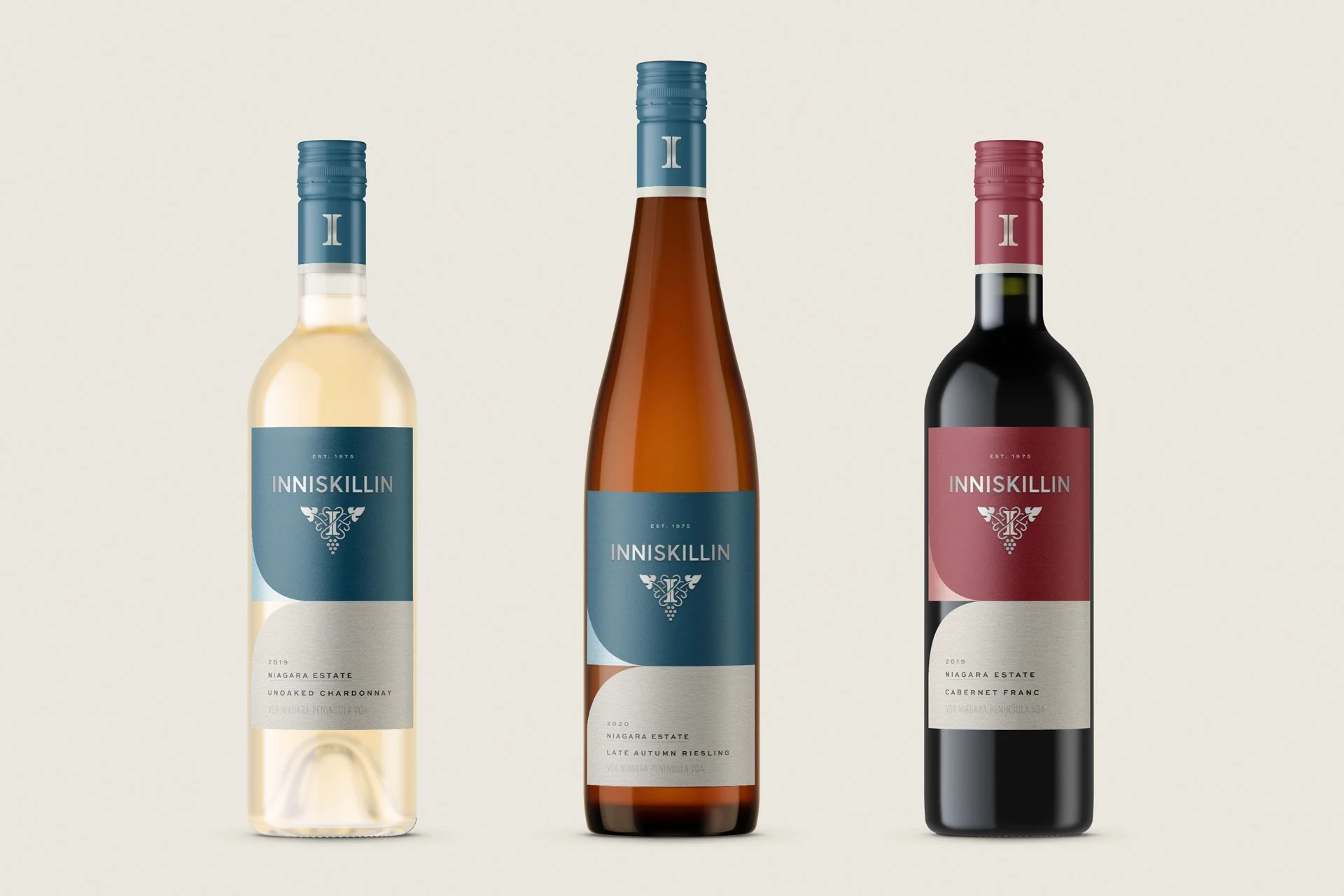
A lineup of five skincare and grooming products with white, green, and orange packaging, including eye cream, deodorant, beard oil, face wash, and shower wash, all branded 'Unity'.
Fitness equipment and personal care products on a wooden floor, including a black kettlebell with '20' marked on it, a metal water bottle, a tube of body moisturizer, a tube of face moisturizer, a green backpack, and part of a treadmill.

Inniskillin

Canada's first estate winery, Inniskillin, is internationally renowned for its award-winning wines and for its pioneering role in establishing the Canadian wine industry.

Jacknife in Toronto is responsible for the brand refresh and they reached out to me to help them set up a label design system that would flow across the entire bottle range. Plenty of research went into this project if you know what I mean.
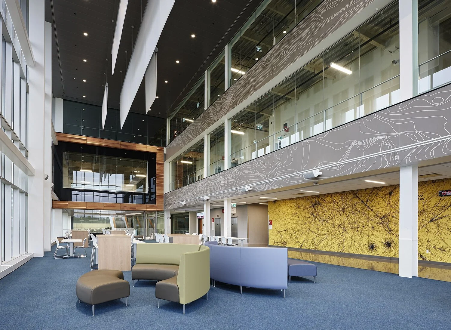
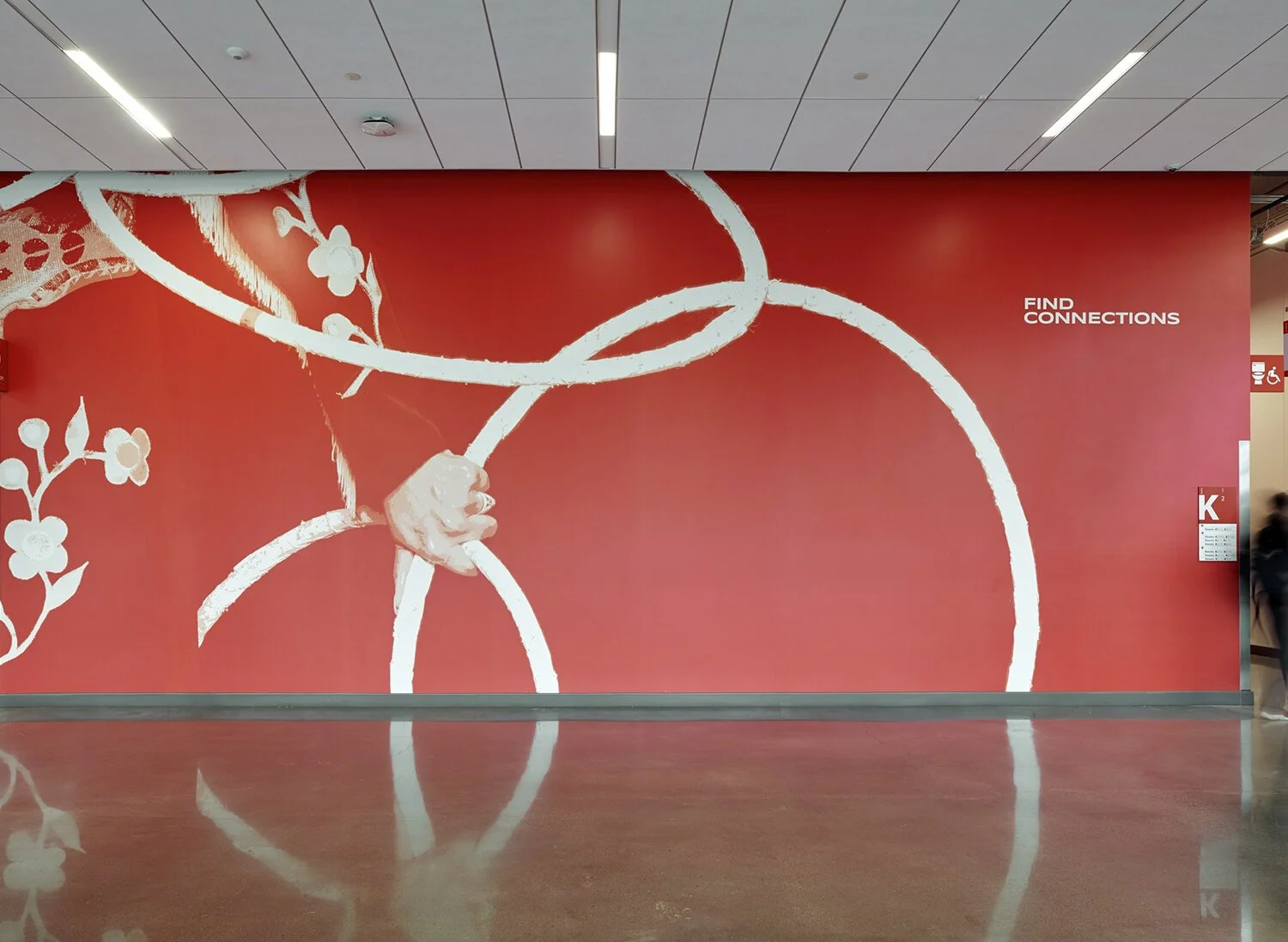
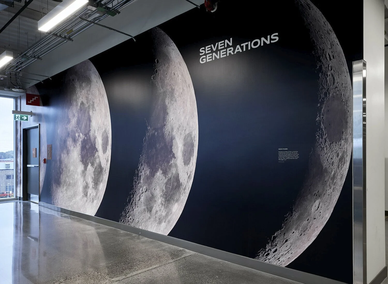
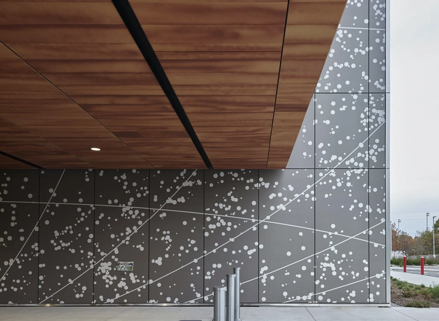
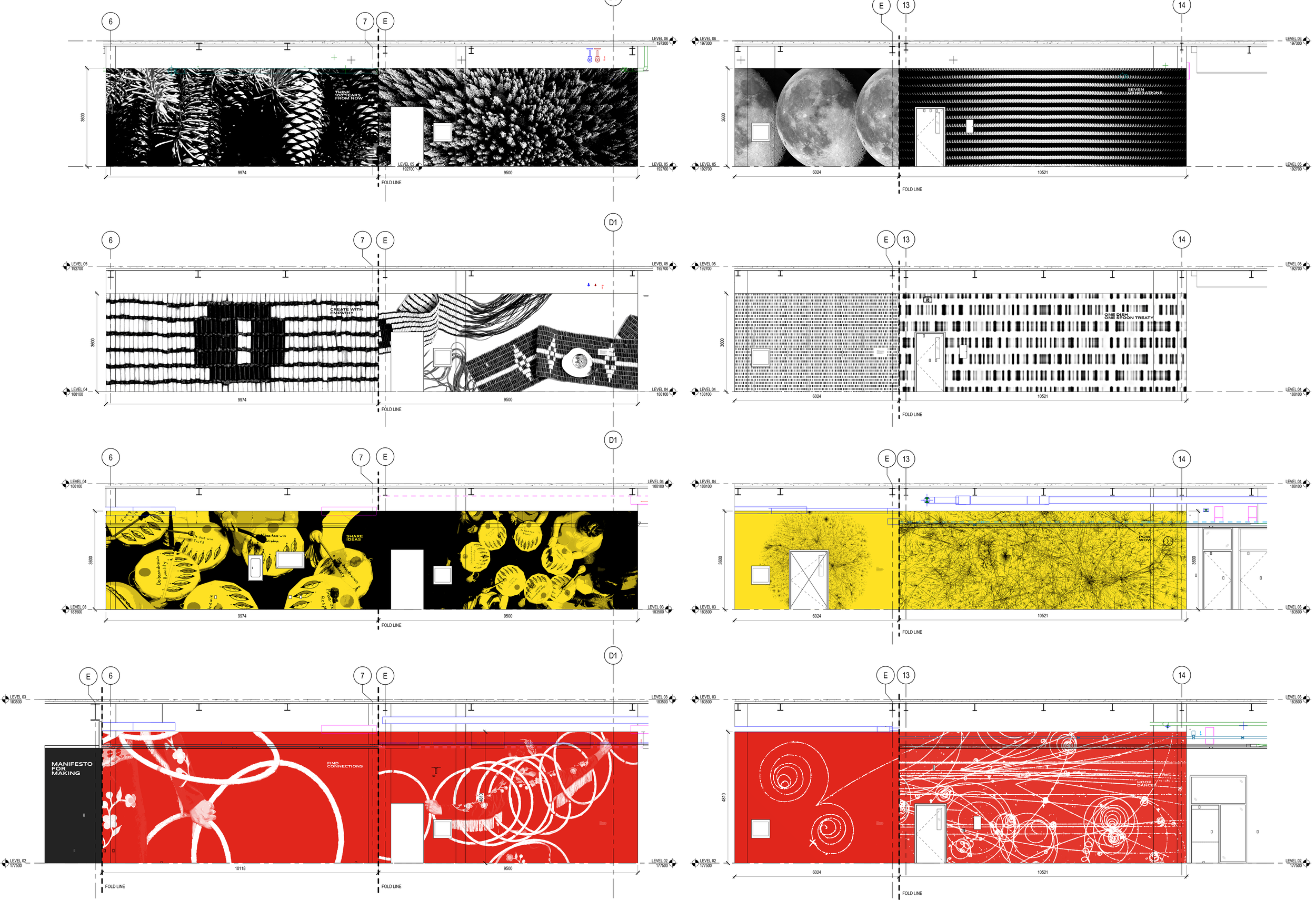
Three bottles of Inniskillin wine, with the left bottle being a 2019 Niagara Estate Unoaked Chardonnay, the middle bottle a 2020 Niagara Estate Late Autumn Riesling, and the right bottle a 2019 Niagara Estate Cabernet Franc, all set against a plain off-white background.

Seneca CITE

Working with BMD in Toronto I was responsible for overseeing the production design of all the large-scale installations throughout the building. Designing on such a grand scale presented many challenges but working closely with vendors we were able to achieve the initial vision in time for the opening ceremony.
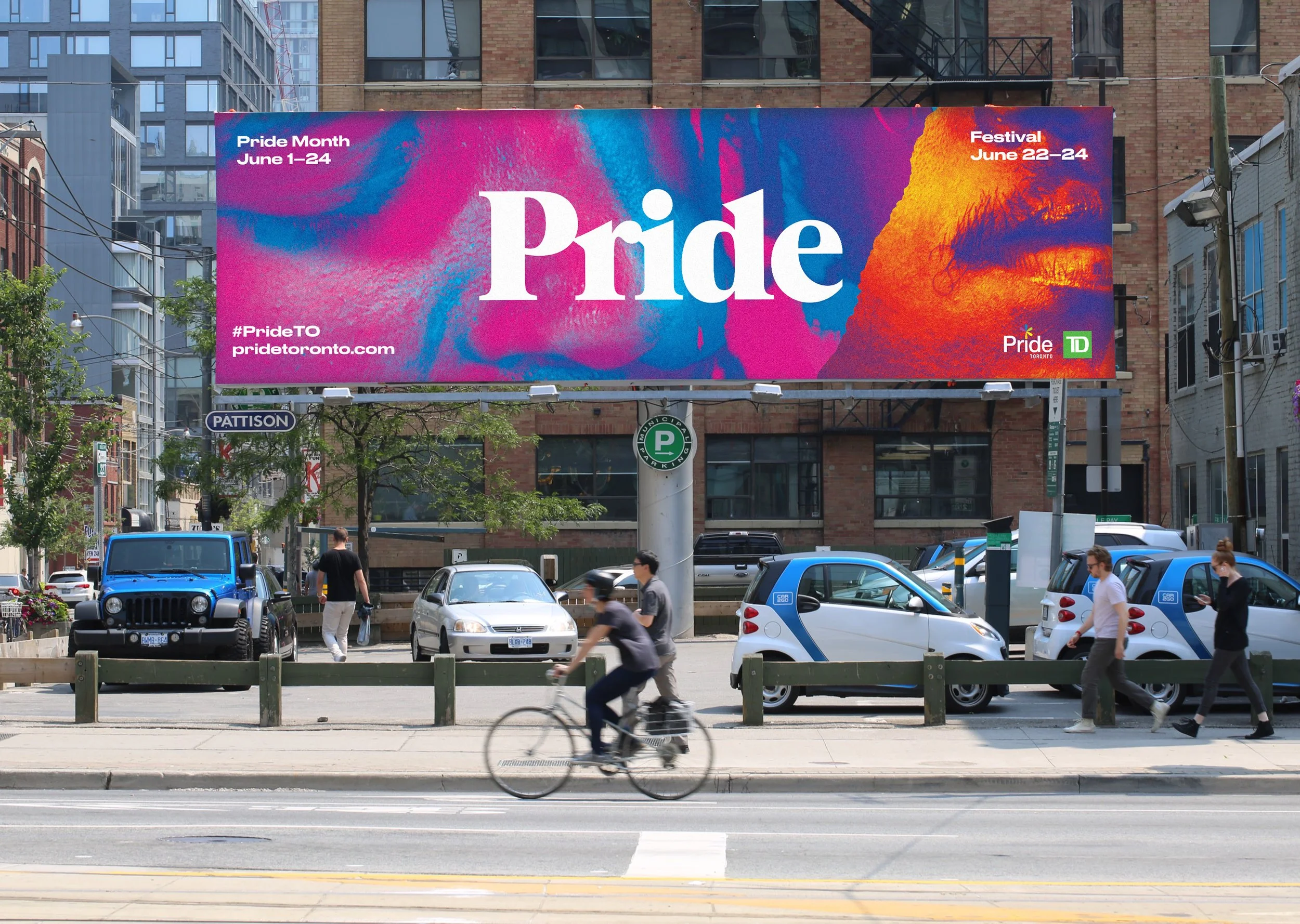
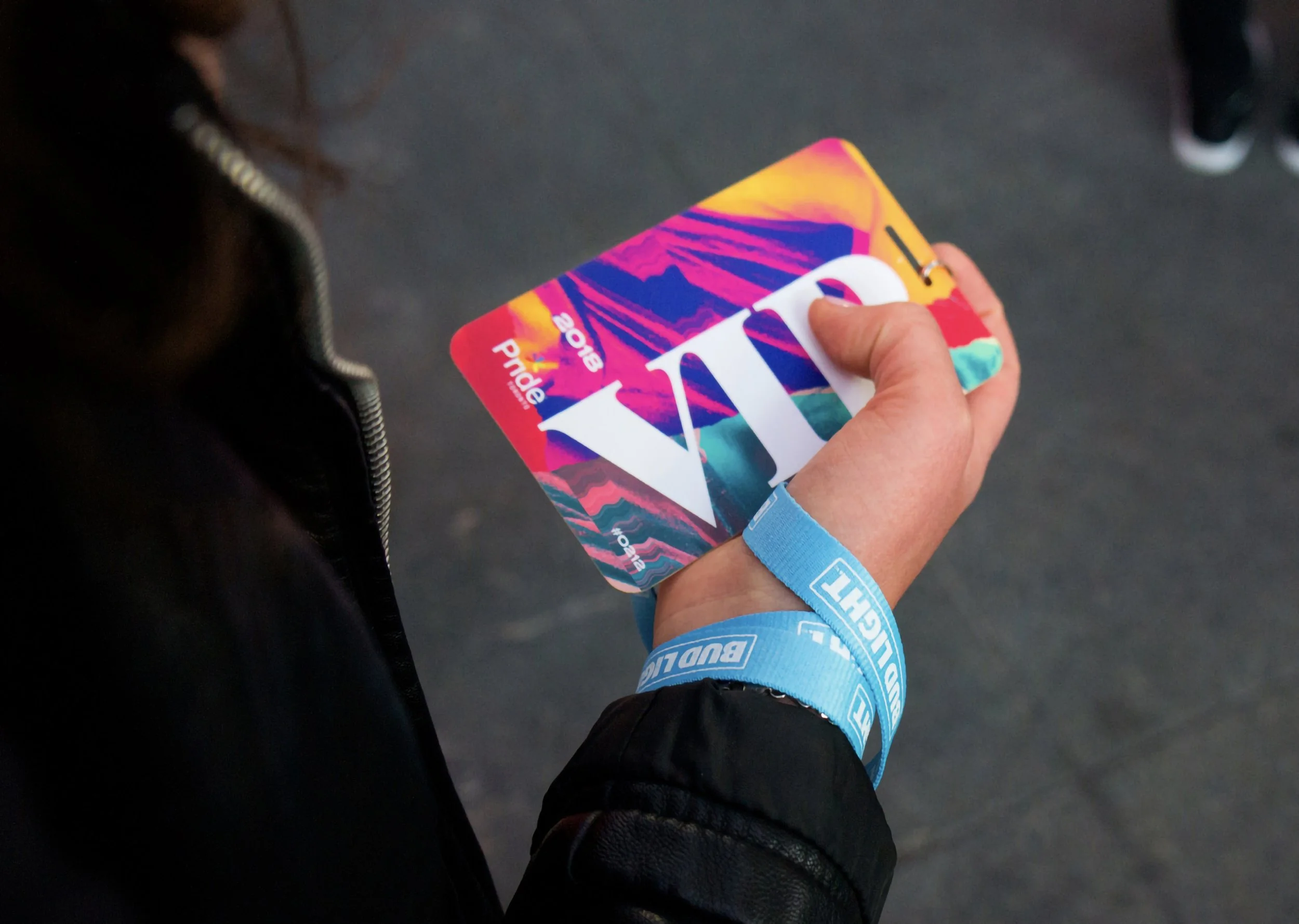
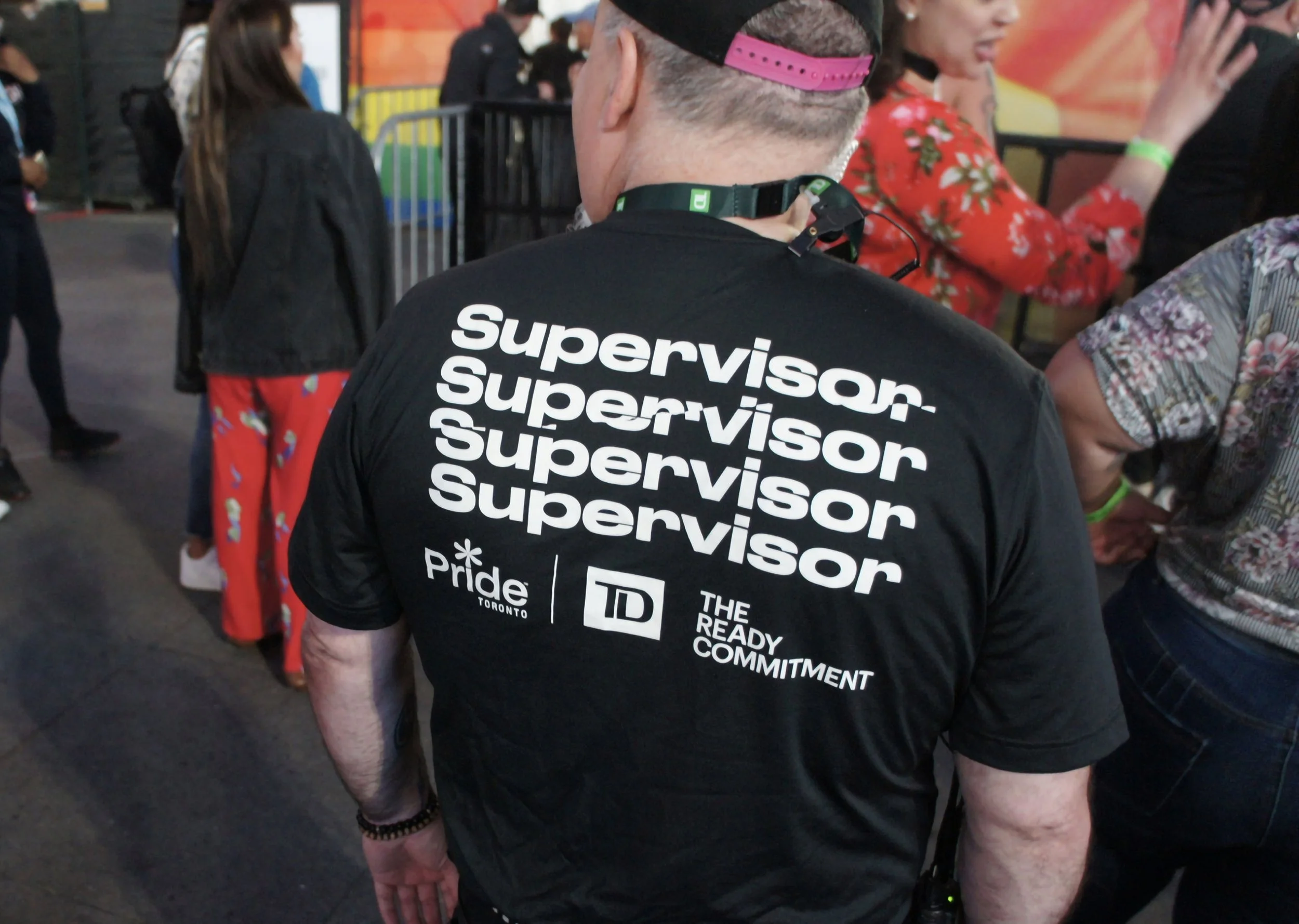
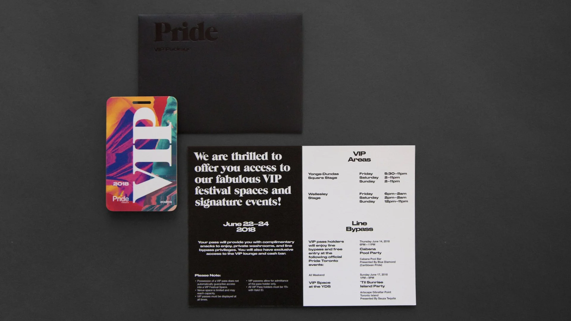
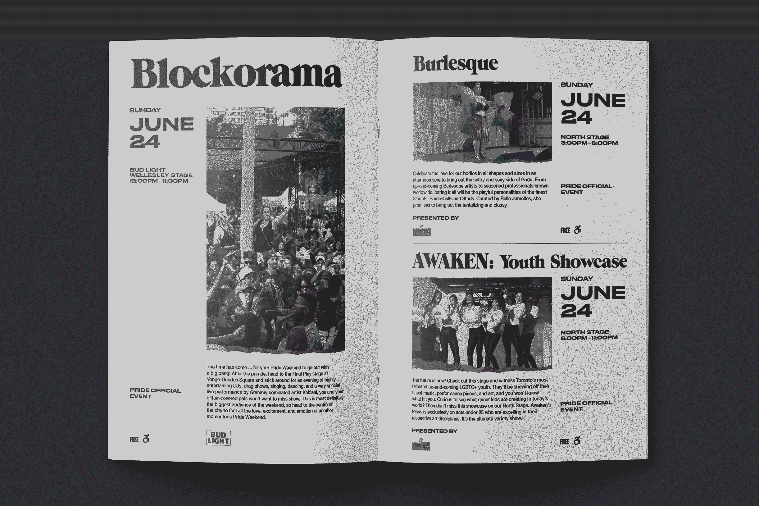
Exterior of a modern building with a gray and wooden facade, large glass windows, and a map graphic with the text "Centre for Innovation, Technology & Entrepreneurship" on the wall.
Interior of a modern office or conference center with seating, glass walls, and abstract wall art.
A red wall with white line art of a bicycle, showing a hand gripping the handlebar, alongside the words "FIND CONNECTIONS" and a sign with a wheelchair symbol.
Wall mural depicting the phases of the moon with the words "Seven Generations" at the top, located in an indoor public space near an elevator.
Modern building exterior with a brown wooden overhang and a gray wall featuring a white dotted and line pattern.
Architectural blueprint with colorful wall designs including plants, moon phases, abstract lines, yellow lanterns, yellow ground patterns, red swirling designs, and white line art on red background.

Toronto Pride

Pride Toronto is a non-for-profit organization with a mission to bring people together to celebrate the history, courage and diversity of the LGBTQ2S+ community. The annual Pride festival has become a major Canadian arts and cultural event and the largest Pride celebration in North America.

Working with BMD in Toronto I was instrumental in the production design of the project from start to finish, taking the initial concept and creating visual standards to be applied across all mediums.

Four colorful Pride festival guides with abstracted and distorted images of people's faces, with text indicating dates June 22-24, 2018, and the word "Pride" across each. Includes a hashtag #prideTO and website pridetoronto.com. The far right has a green TD logo.
A large advertising billboard in an urban area promoting Pride Month and Pride Festival in Toronto, with dates June 1-24 and June 22-24. The billboard features colorful, abstract artwork and the word 'Pride'. There are pedestrians walking on the sidewalk and several parked cars and a cyclist in front of the billboard.
Close-up of a hand holding a colorful, abstract design WS bike pass with a blue wristband, person wearing a black jacket with a zipper, standing on a paved surface.
Colorful poster with artistic images of two people, text reading 'June 22-24' and '2018', a logo for Pride Toronto, and the hashtag #prideTO along with the website prideToronto.com.
A person wearing a black T-shirt with the words 'supervisor' repeated multiple times on the back at a Pride event. The shirt also features logos for Pride Toronto, TD Bank, and The Ready Commitment, and the individual is wearing a pink cap.
A colorful Pride VIP pass card, a black flyer with white text about VIP festival access, and a white flyer listing VIP event details, all on a dark surface
Open newspaper featuring events on June 24: Blockorama at Wellesley Stage from 12:00 PM to 11:00 PM, Burlesque at North Stage from 3:00 PM to 6:00 PM, and AWAKEN Youth Showcase at North Stage from 6:00 PM to 11:00 PM. Each event description includes details and images of performers and attendees.

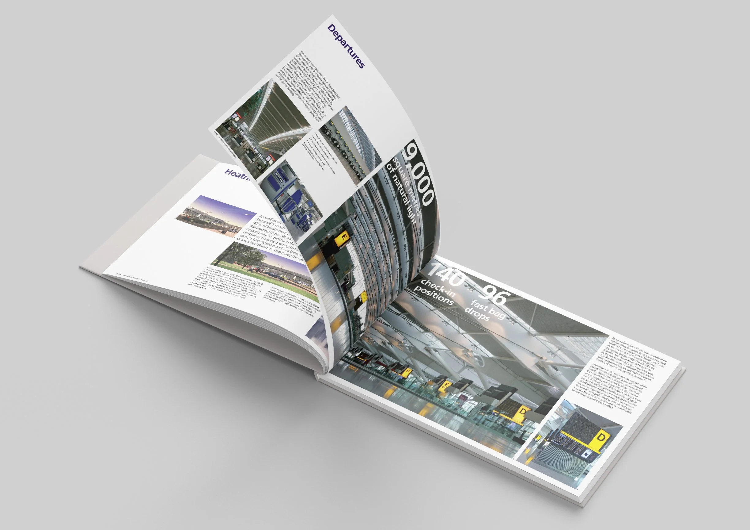
Heathrow Terminal 5 Book

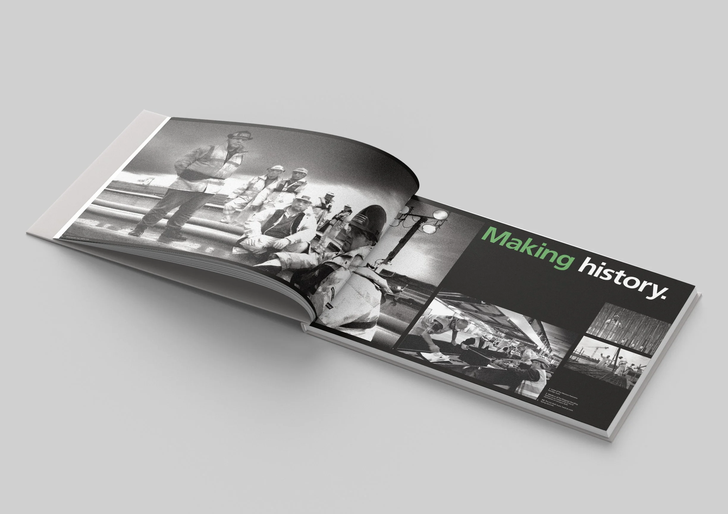
20 years in the making, Heathrow’s Terminal 5 is a massive engineering accomplishment and to document it Heathrow commissioned The Team in London to create a massive premium finish coffee table book showcasing the entire journey from the initial proposal to the opening of the building.

The Team reached out to me early on in the process, an initial grid system had been established, I took that and designed the entire book, working closely with the project manager to ensure all content was collated and documented from multiple sources. I retouched over 300 images to ensure the journey though the book looked seamless. The project took around 4 months of dedicated time from the start to the final printed book, going through various approval processes along the way.

I can’t confirm this but I was told a copy was given to the Queen when she officially opened the building, I imagine it sitting in one of the bathrooms.
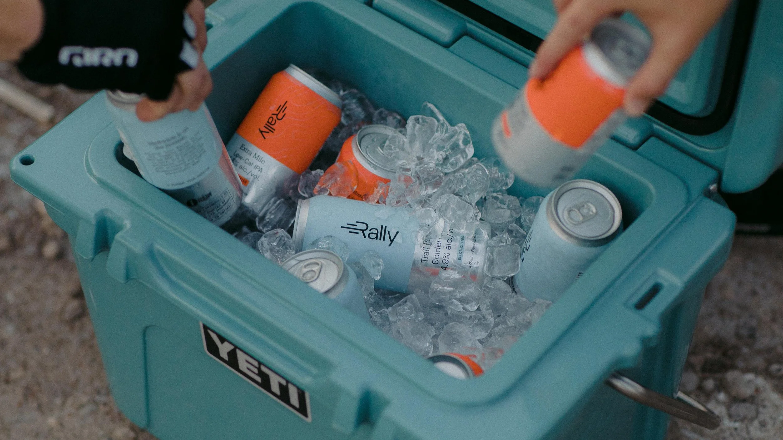
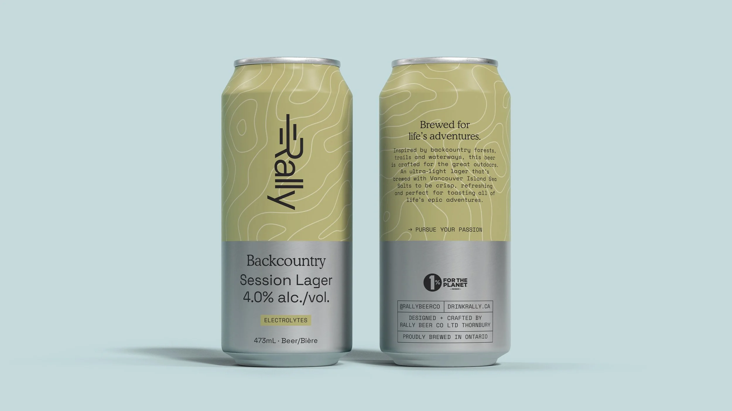
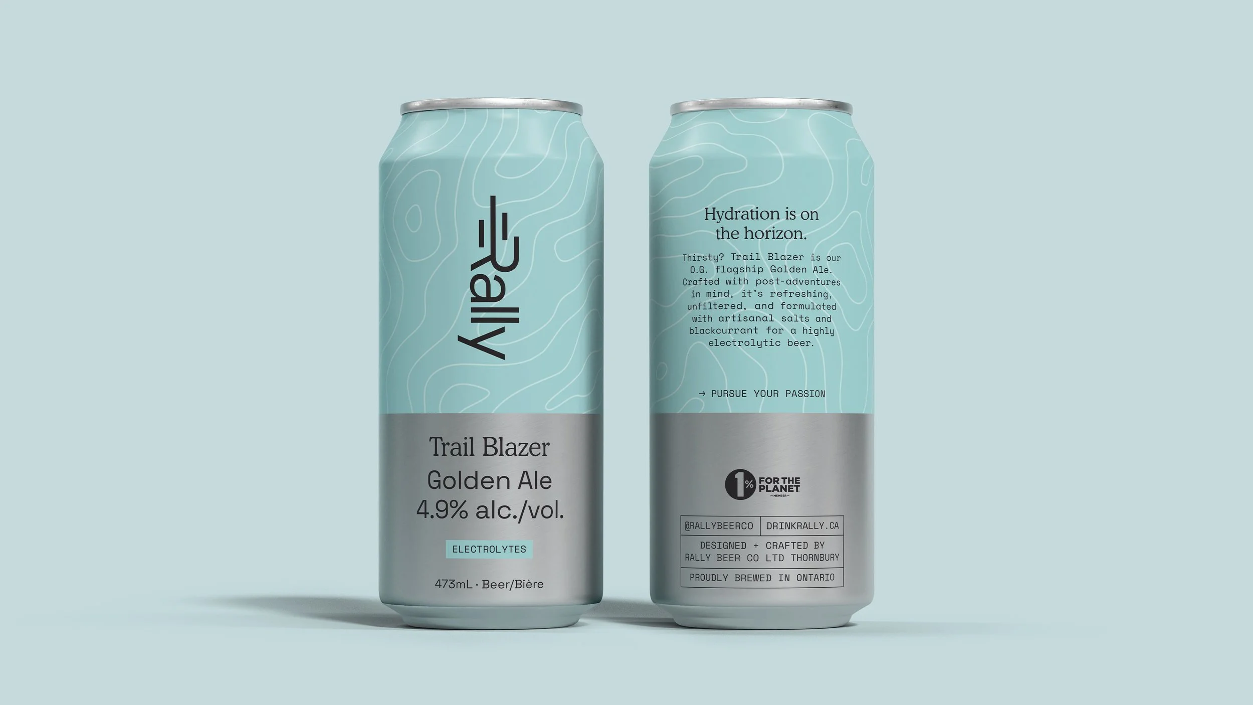
Magazine cover featuring a modern building with a glass facade and a tower in the background, titled 'Terminal 5 Transforming Heathrow'.
Open magazine with black and white photos of people working at an airport, including a person with a megaphone and workers at a baggage claim area, accompanied by the text 'Making history.'
Open airport terminal with rows of empty brown chairs, digital departure screens, and architectural ceiling design.
Open magazine showing images and articles about airport design, including departures, check-in, and baggage drops.

Rally Beer Company

Rally was founded with an adventurous spirit and a firm belief in being better by doing better. Designed for those who like to sweat, it’s a first of its kind functional beer brewed with active ingredients. Light on alcohol, big on flavour, high in electrolytes, and low in calories.

Rally reached out to me when they were first starting out to help take their packaging concepts to the final product, working with the printer I adapted the designs into the cans you see in stores today.
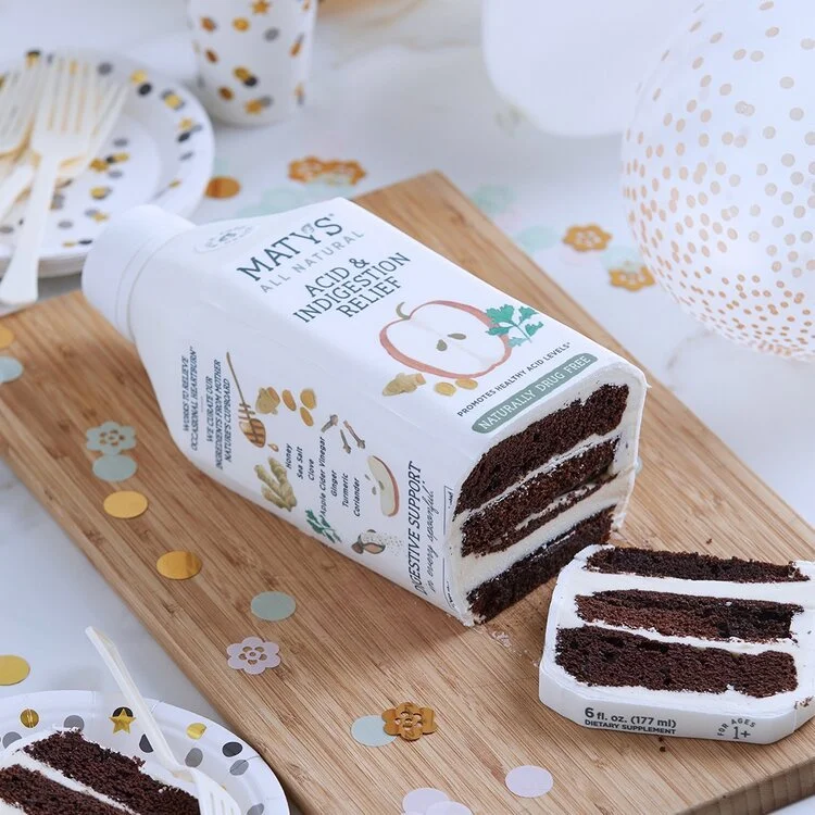
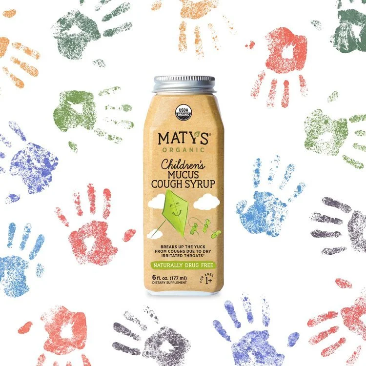
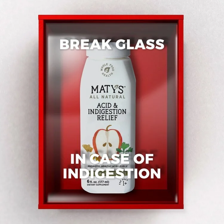
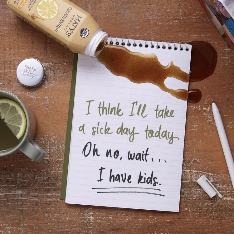
A turquoise cooler filled with ice and canned beverages, with hands placing cans inside.
Two cans of Backcountry Session Lager with 4.0% alcohol, featuring a pale green top half with contour lines and a gray bottom half with black text and labels, set against a light blue background.
Two cans of Rally Trail Blazer Golden Ale with light blue labels featuring white topographical line patterns, showing the front and back sides of the cans. The label indicates 4.9% alcohol, electrolytes, and that the beer is brewed in Ontario. The back label mentions hydration and hints at it being a highly electrolytic beer.

Maty’s

Maty's products are clean remedies for babies, children & adults. The ingredients provide safe & effective alternatives to modern medicine.

Oliver reached out to me to create 30 new social posts for Maty’s which would cover a 3 month period. I was responsible for the conceptualization of each post and then the follow-through to completion. A large amount of the posts required new photography for which I art directed a 2 day photoshoot. I was responsible for the image creation and retouching of each post, some of them included motion.

One of the highlights was commissioning a cake to be made in the shape of one of the bottles, we got to eat it after the shoot, probably the most expensive chocolate cake I’ve ever eaten.

A partially unwrapped chocolate cake on a wooden board, with musical notes-shaped and round confetti scattered around, and some plates with cake slices and party decorations in the background.
A bottle of Maty's Organic Children's Mucus Cough Syrup surrounded by colorful handprints in red, blue, green, orange, and black on a white background.
A red box contains a white bottle labeled 'Maty's All Natural Acid & Indigestion Relief' with a graphic of an apple and ginger root, and text that says it promotes healthy acid levels. White text overlaying the image reads 'BREAK GLASS IN CASE OF INDIGESTION.'
A notebook with a humorous handwritten message, spilled coffee, a lemon tea, and a tube of honey on a wooden table. The message reads, "I think I'll take a sick day today. Oh no, wait... I have kids."